User Management Function: Customize User Interface Themes
Overview
You can change the color variation of the screen by setting the theme. The second-generation theme not only introduces color variations but also enhances the overall usability of the screen compared to the first-generation, including the navigation menu.
Limitations
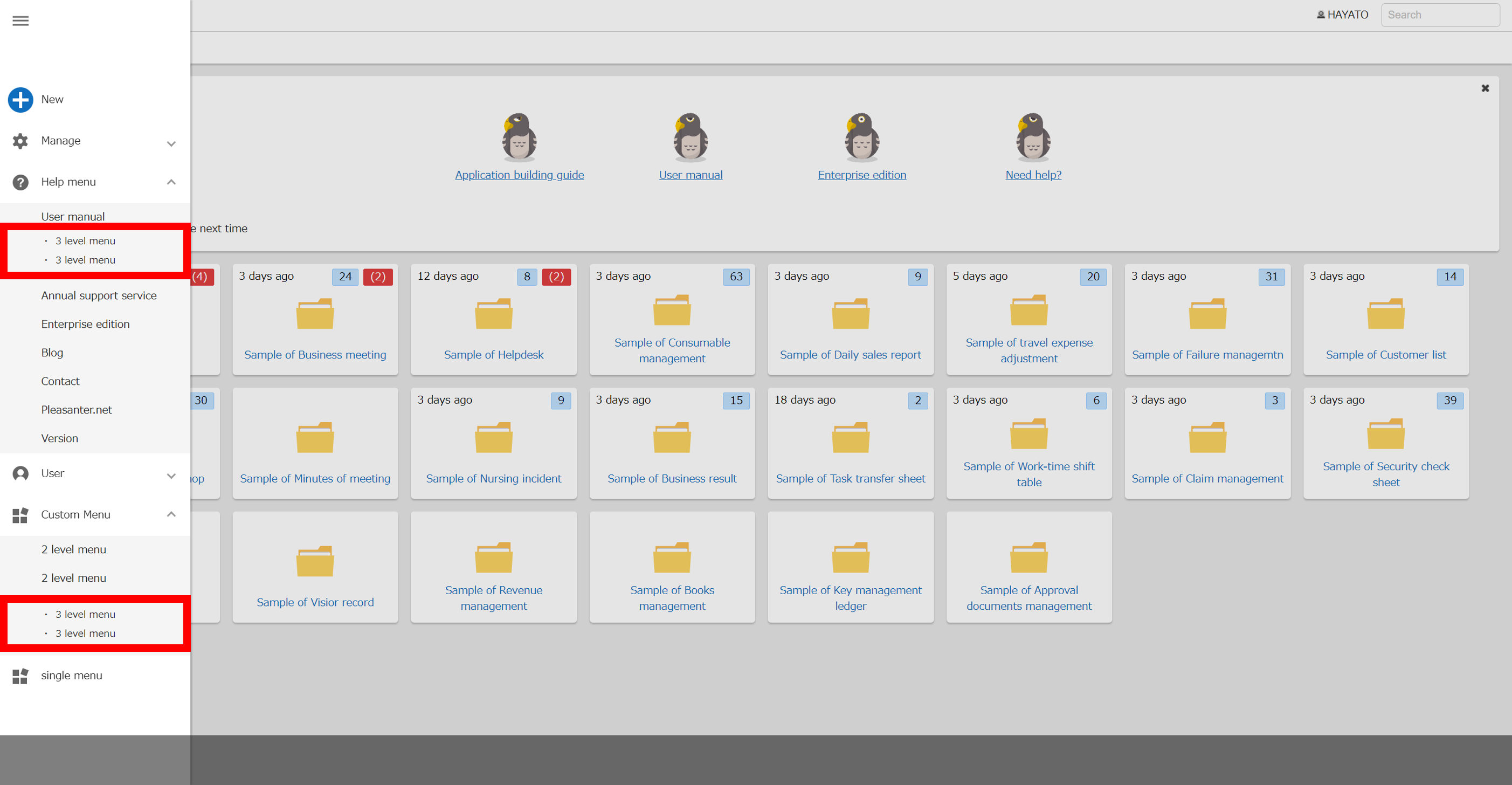
- For the second-generation user interface theme, you can add child menus up to three levels using "NavigationMenu.json" or "Extended Navigation Menu".
- In the case of the second-generation user interface theme, specifying an icon using "NavigationMenu.json" or "Extended Navigation Menu" is not supported.
- In the case of mobile devices, even if the second-generation user interface theme is set, the same image (responsive) as the old-generation theme is displayed.
Operation Procedure
Users can change the theme to their own screens by following the steps below.
1. Click "Edit Profile" under the "Users" menu in the "Navigation Menu".
1. Select "Theme".
1. Click the "Update" button at the bottom of the screen.
Theme Application Priority
There are three column to specify the theme in the following order of priority applied to the screen.
1. "Theme" in "User Management Function"
1. "Theme" in "Tenant Management Function"
1. "Theme" in "User.json"
Theme Default Value
- The default value of "Theme" in "User Management Function" is "Not specified".
- The default value of "Theme" in "Tenant Management Function" is "Not specified".
- The default value of "Theme" in "User.json" is "cerulean".
User Interface Generation Classification
Default User Interface Generation Classification
The default value of "Theme" in "User.json", "Cerulean", is a theme that belongs to the second-generation user interface.
How To Apply The Old-Generation Theme
You can apply the old-generation user interface theme other than the default. Please refer to the priority order of "Theme Default Value" mentioned above and modify the settings of "User Management Function", "Tenant Management Function" and "User.json" to select the column value so that the old-generation theme is applied.
Second-Generation User Interface
Second-Generation User Interface Layout
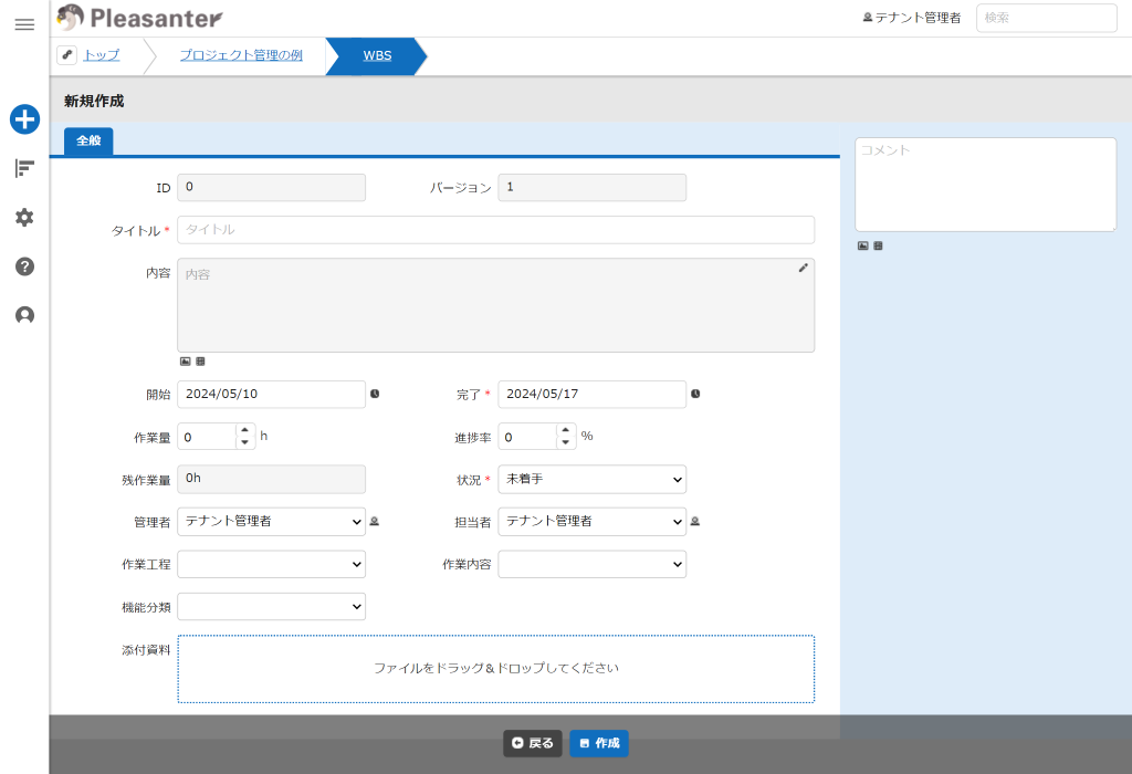
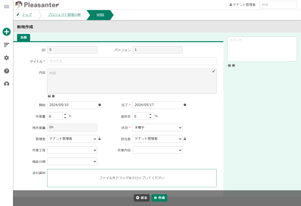
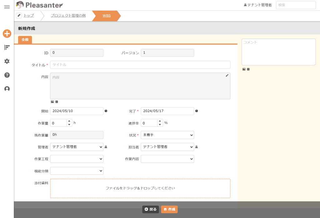
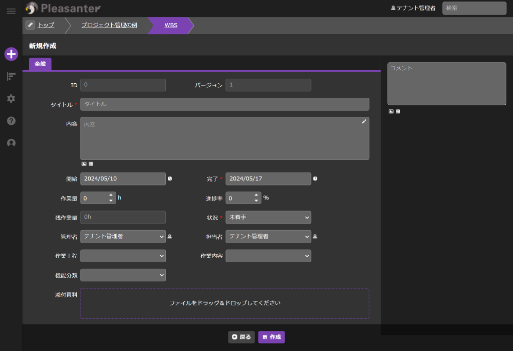
The second-generation user interface is a layout in which the navigation menu is displayed on the left side of the screen.

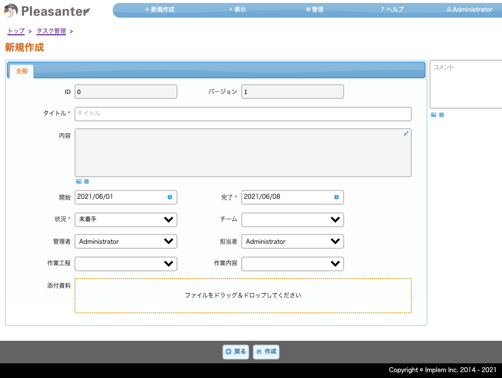
List Of Second-Generation User Interface Themes
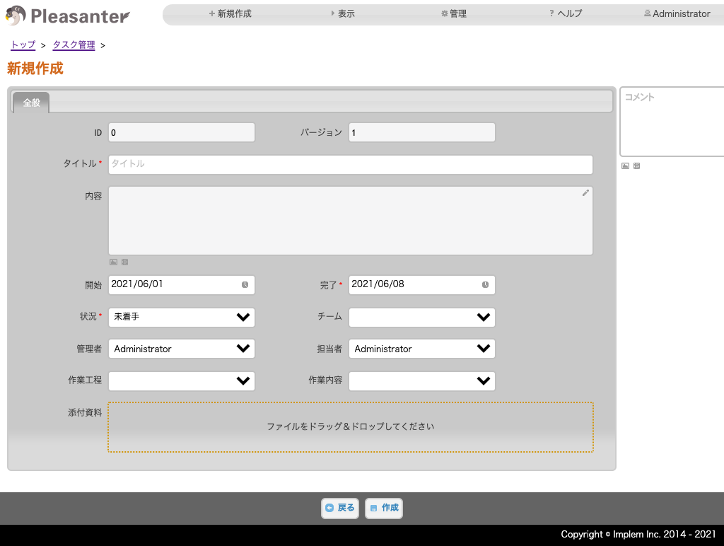
- You can choose from the following themes.
Additional Menus Using Custom Navigation Menus In The Second-Generation User Interface
You can add child menus up to three levels deep using "NavigationMenu.json" in the second-generation user interface.
First-Generation User Interface
First-Generation User Interface Layout
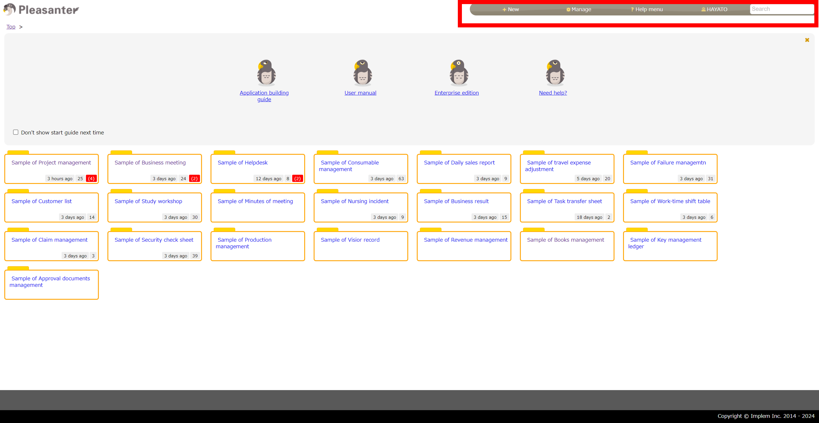
The first-generation user interface is a layout in which the navigation menu is displayed in the upper right corner of the screen.
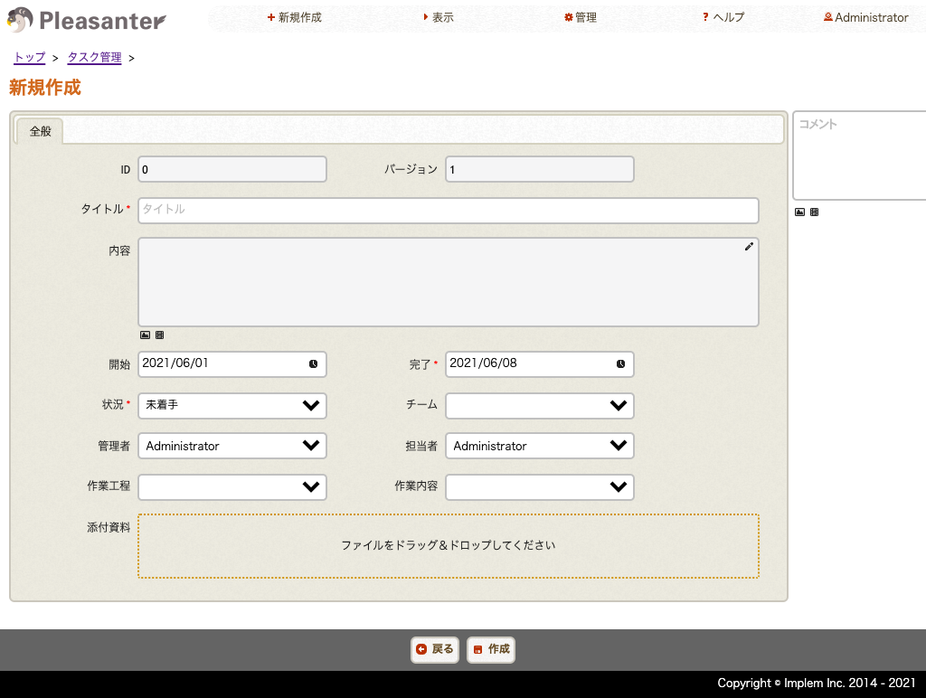
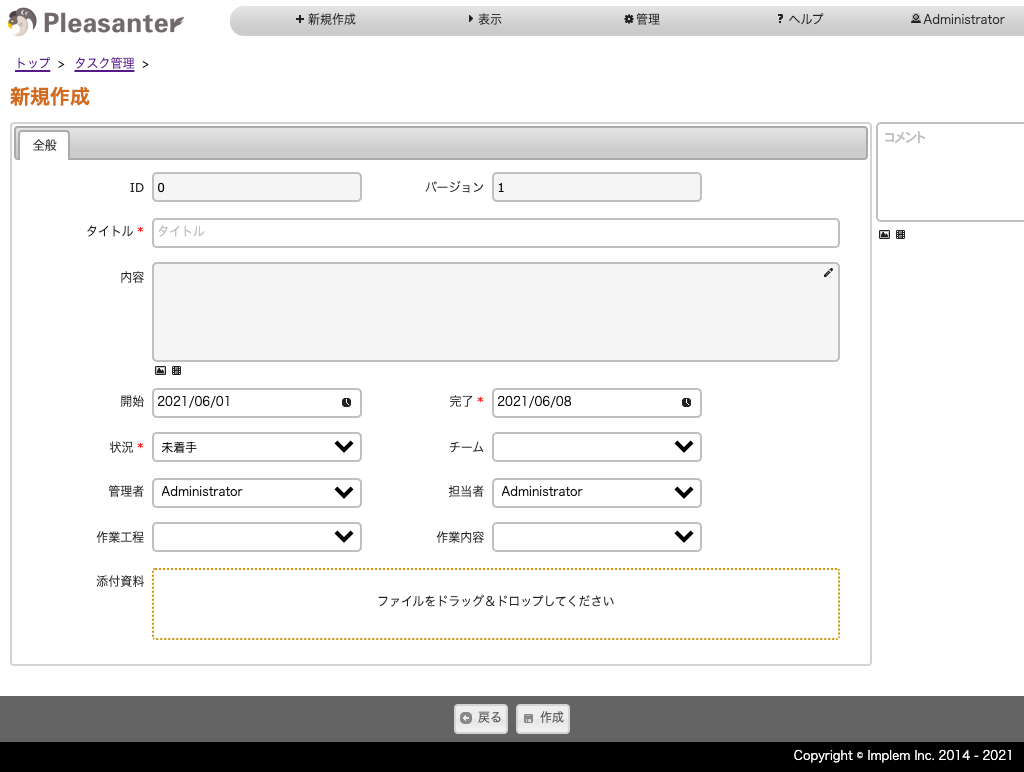
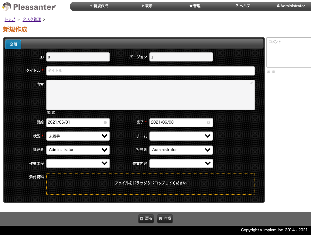
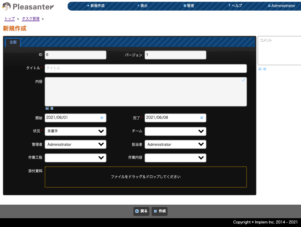
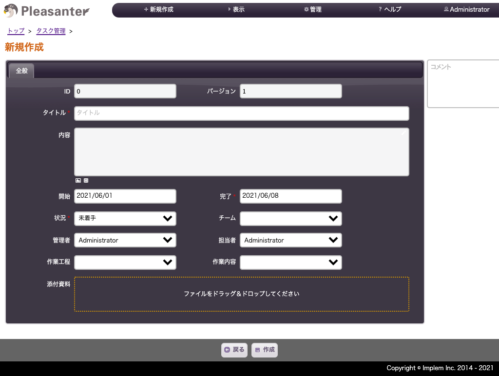
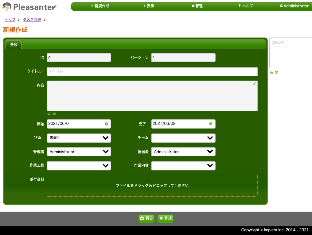
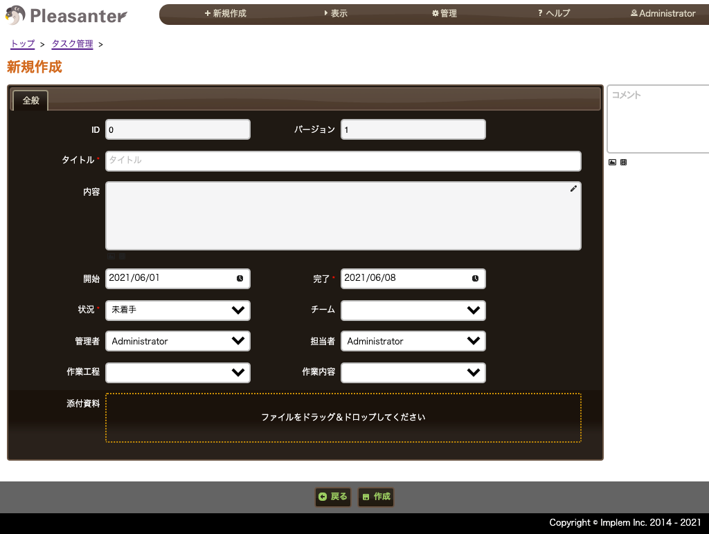
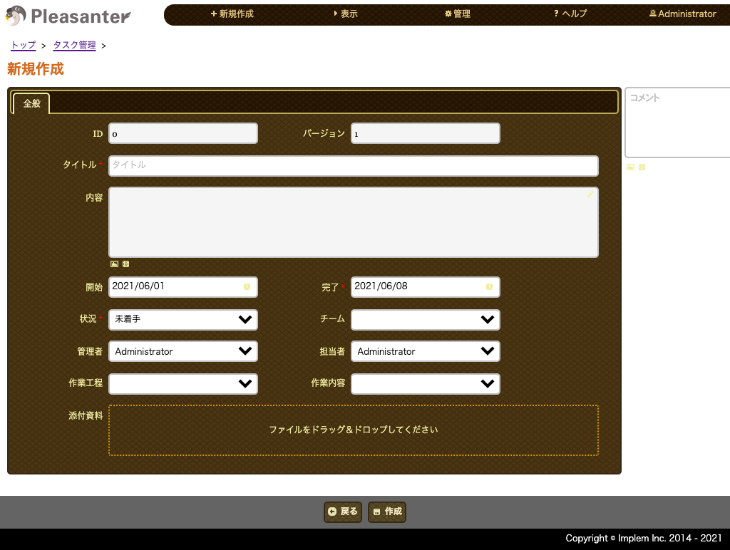
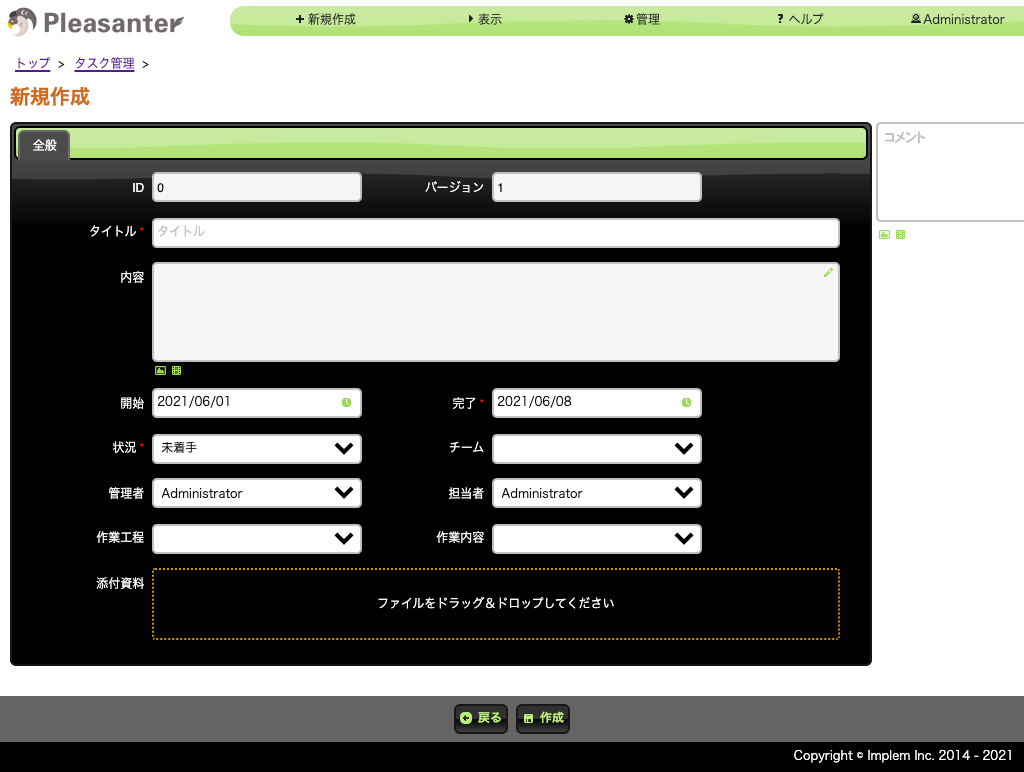
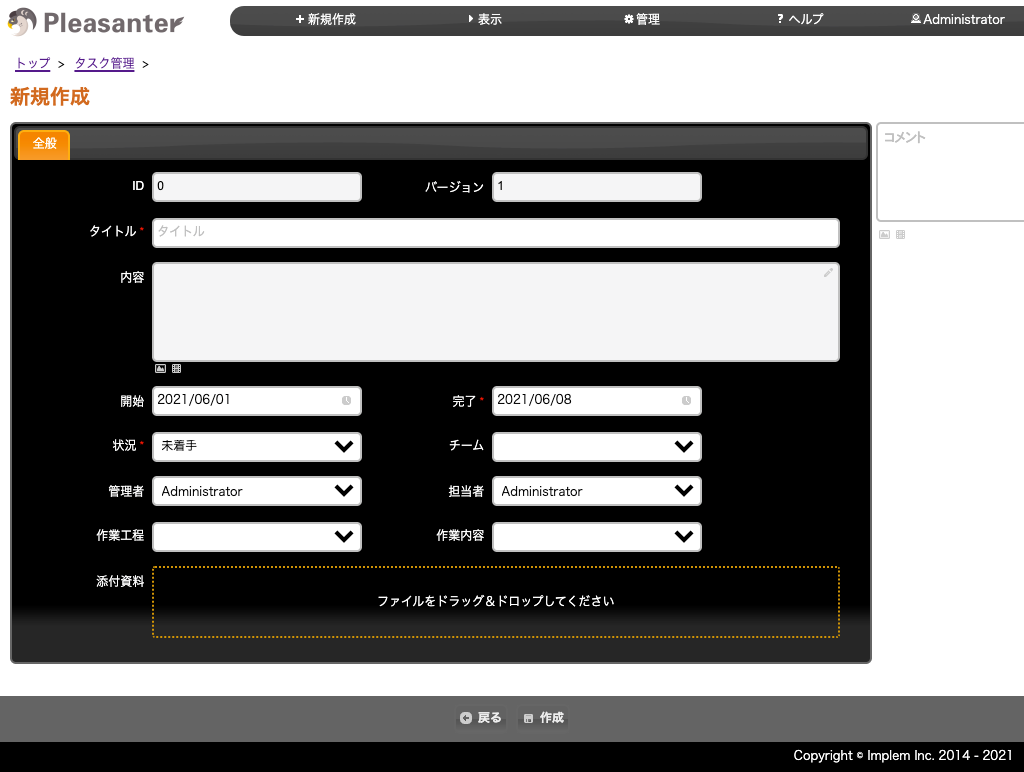
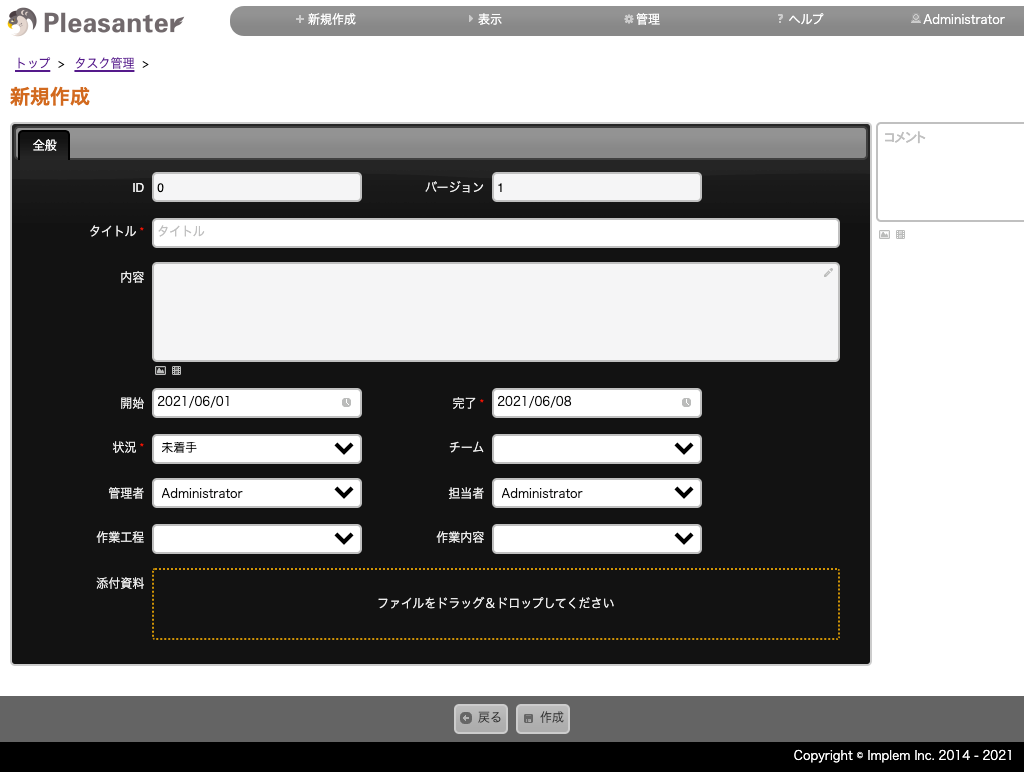
List Of Themes For The First-Generation User Interface
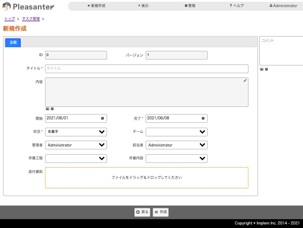
- You can choose from the following themes.
- The selectable values are the theme names of jQuery UI.
Light Themes
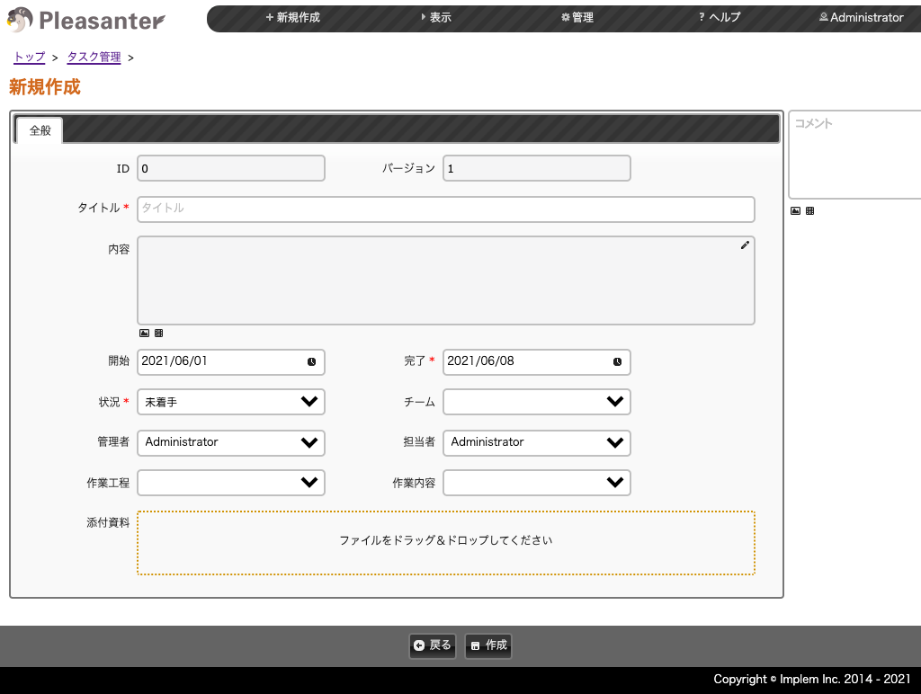
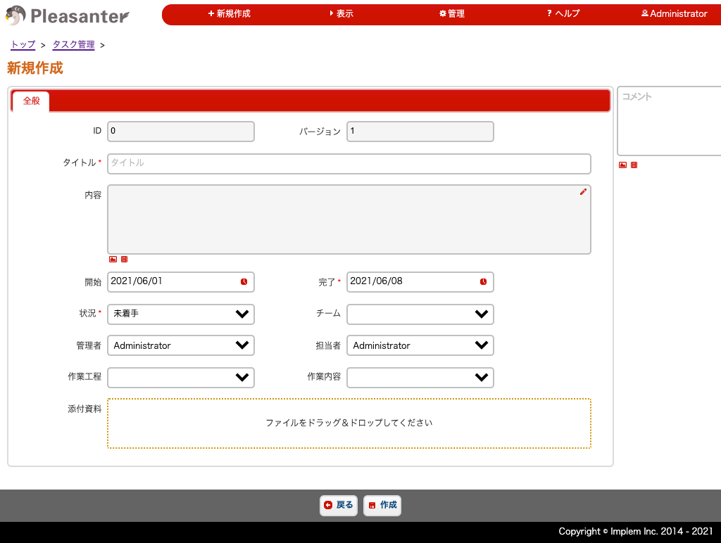


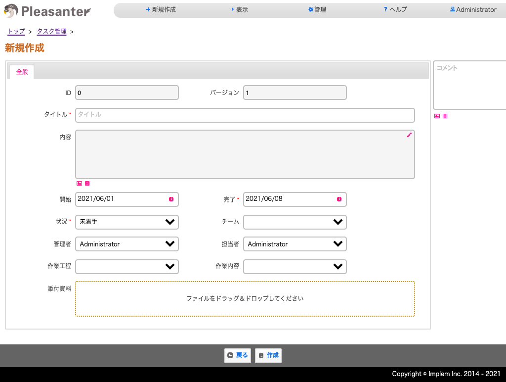
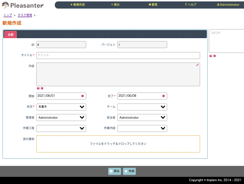
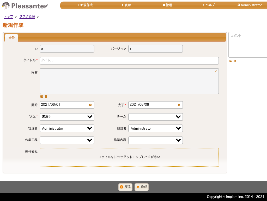

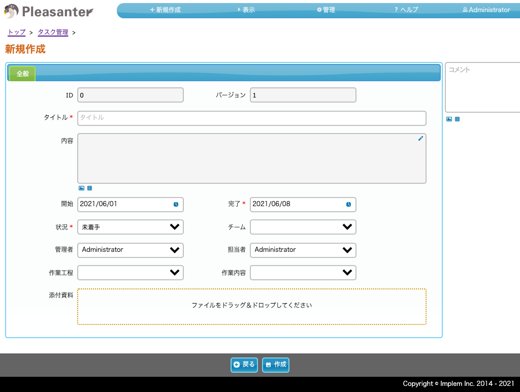
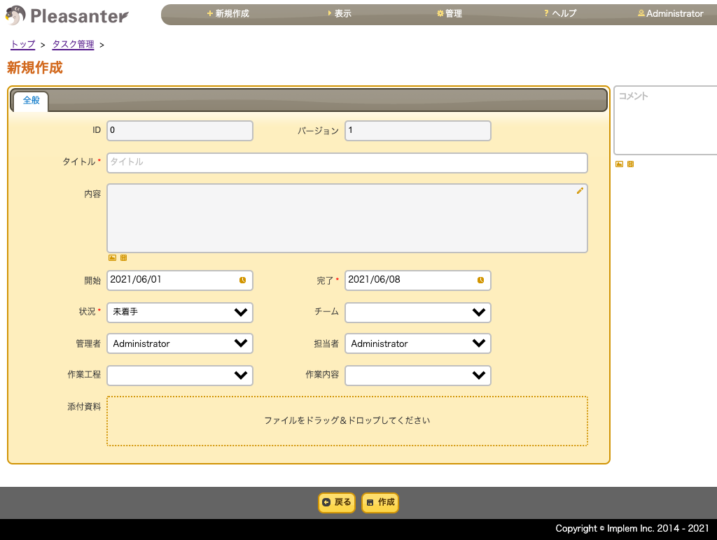
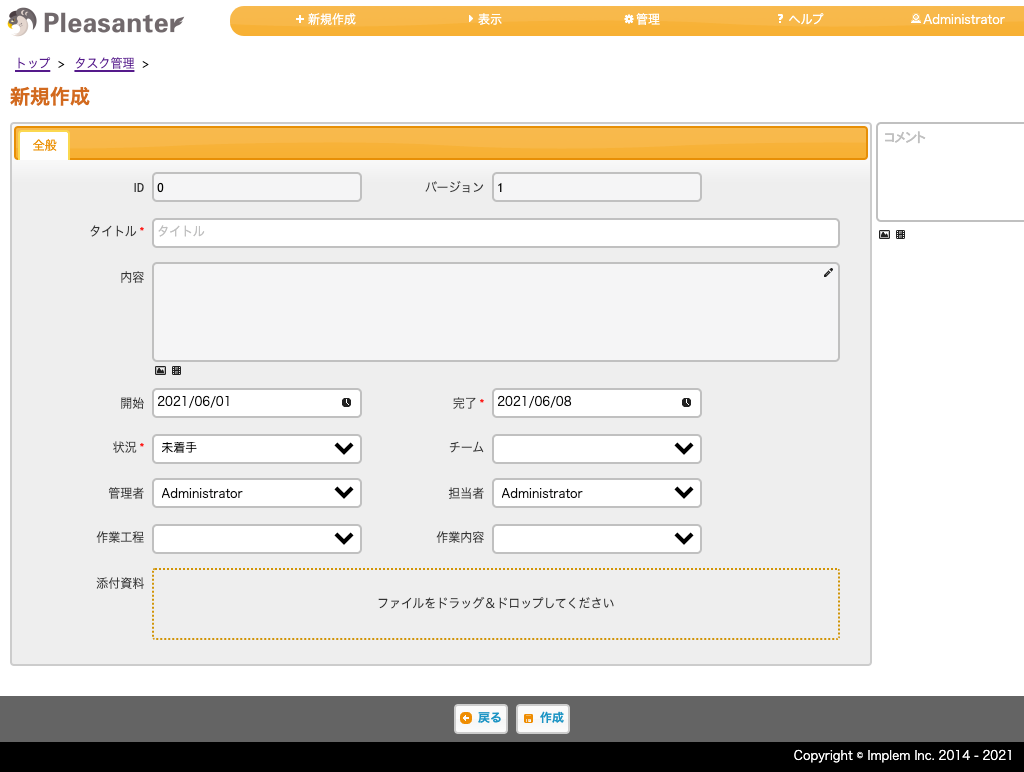
Dark Themes
Supported Versions
| No | Contents | Supported versions |
|---|---|---|
| 1 | Added a user-level theme selection feature to Pleasanter. | 1.1.27.0 or later |
| 2 | Added a user-level theme selection feature to Pleasanter.NET Framework version. | 0.50.251 or later |
| 3 | Renewed the design with a new UI. /Changed the default theme from "sunny" to "cerulean". | 1.4.3.0 or later |