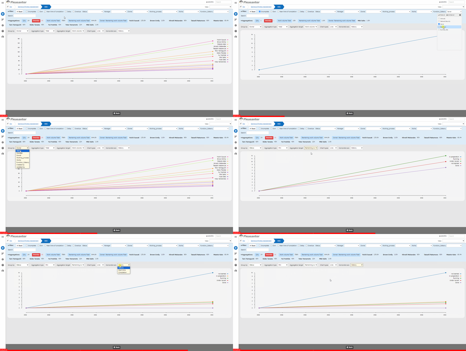
Table Function: Display A Time Series Chart Of Records
## Overview
Displays the "Records" stored in a "「Table」" in the form of a "「Time Series Chart」".
## Prerequisites
* Read permission is required.
## Operation Procedure
1. Open the table list screen.
1. Open the "Display" menu and click "「Time Series Chart」".
## Display Switching Columns
In the "「Time Series Chart」", you can choose from two types of charts: "Area" and "Line".
The screen image for switching between area chart and line chart is as follows.
### Area Chart

### Line Chart

The vertical and horizontal axes can be switched by selecting each column at the top of the chart.
| No |Column| Description|
|:---|:---|:---|
| 1 | Classification| Select the vertical axis from the class column. |
| 2 | Aggregation type | Select from "Number of columns", "Total", "Average", "Maximum", or "Minimum". |
| 3 | Aggregation target (*1)| Select from any numerical value column or "Work volume" or "Remaining Work Volume". |
| 4 | Chart type | Select from "Area" or "Line". |
| 5 | Horizontal axis | Select from any date column or "「History」", "Start", or "Complete".|
*1 The "Aggregation Target" column will only be displayed on the screen if you select anything other than "Number of columns " for "Aggregation Type".
## About the chart display
The chart display content will differ depending on the "Chart Type" and "Horizontal Axis" columns selected.
### Area Chart
|Horizontal axis|Chart display|
|:---|:---|
|History|Chart with elements of each classification stacked on top|
|Non-history|Chart with elements of each classification aggregated separately|
### Line Chart
|Horizontal axis|Chart display|
|:---|:---|
|All columns|Chart with elements of each classification aggregated separately|
## About The Display Colors Of Line Charts
The display colors of line charts use the color set available in the Java Script library "D3.js". To make it easier to distinguish the charts, the color set used varies depending on the number of displays.
|Display number|Color set|d3-scale name|
|:---|:---|:---|
|10 or less|10 color set|d3.schemeCategory10|
|11 or more|20 color set|d3.interpolateRainbow|
### Reference URL
https://github.com/d3/d3-scale-chromatic/blob/main/README.md
## Time Series Chart Settings
You can change the settings for the "「Time Series Chart」". This operation requires site administration privileges.
1. Open the target table.
1. Click "[Manage Table](/en/manual/table-management)" from the "Administration" menu.
1. Open the "「Time Series Chart」" tab.
1. Configure the settings according to the table below.
|Column name|Description|Setting method|
|:---|:---|:---|
|Enable|Enable/disable the time series chart|Check to enable time series chart|
5. Click the "Update" button at the bottom of the screen.
## Related Information
<div id="ManualList"><ul><li><a href="/en/manual/table-management">Manage Table</a><span>12.09.2025 up</span></li></ul></article></div><input id="SearchTextHidden" type="hidden" value="" />
