Table Function: Display Record Analysis Chart
## Overview
Displays the records stored in the table in the form of an analysis chart.
## Prerequisites
Read permission for the site is required.
## Operation Procedure
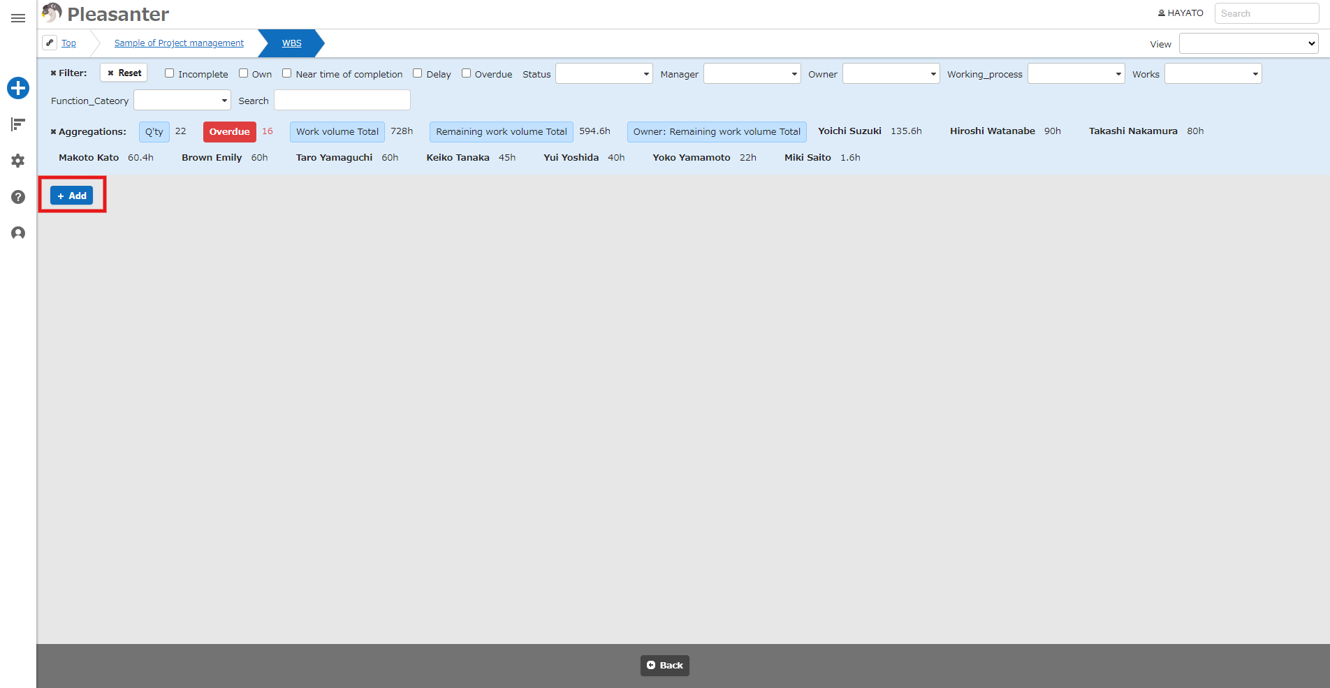
1. Open the table list screen.
2. From the navigation menu, click "View" - "「Analysis Chart」".
3. Click the Add button.
4. In the Analysis part dialog screen, specify the creation conditions.
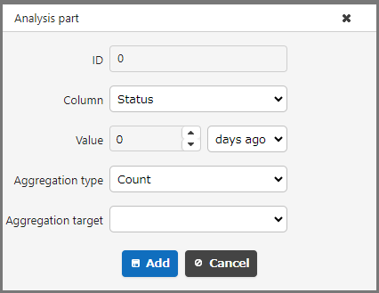
### Analysis parts (creation conditions)
| No | Column | Description |
|:---|:---|:---|
| 1 | Column | Specify the columns to be grouped in the pie chart from "[Status](/en/manual/table-management-status)", "Manager", "Owner", "ClassA (class column with enabled options), etc.", "Created by", or "Updated by". |
| 2 | Value (left: numerical value) | Specify the numerical value to be used as the aggregation time. |
| 3 | Value (right: period) | Select the period to be used as the aggregation time from "Days ago", "Months ago", "Years ago", "Hours ago", "Minutes ago", or "Seconds ago". |
| 4 | Aggregation type | Select how to aggregate from "Number", "Total", "Average", "Maximum", or "Minimum". |
| 5 | Aggregation target | Select what to aggregate from "Work volume", "Remaining Work Volume", "NumA (enabled numerical value column), etc." |
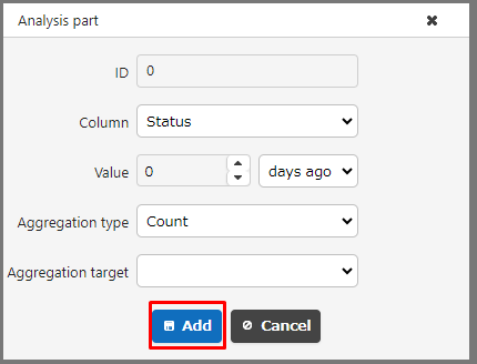
5. Click the Add button.
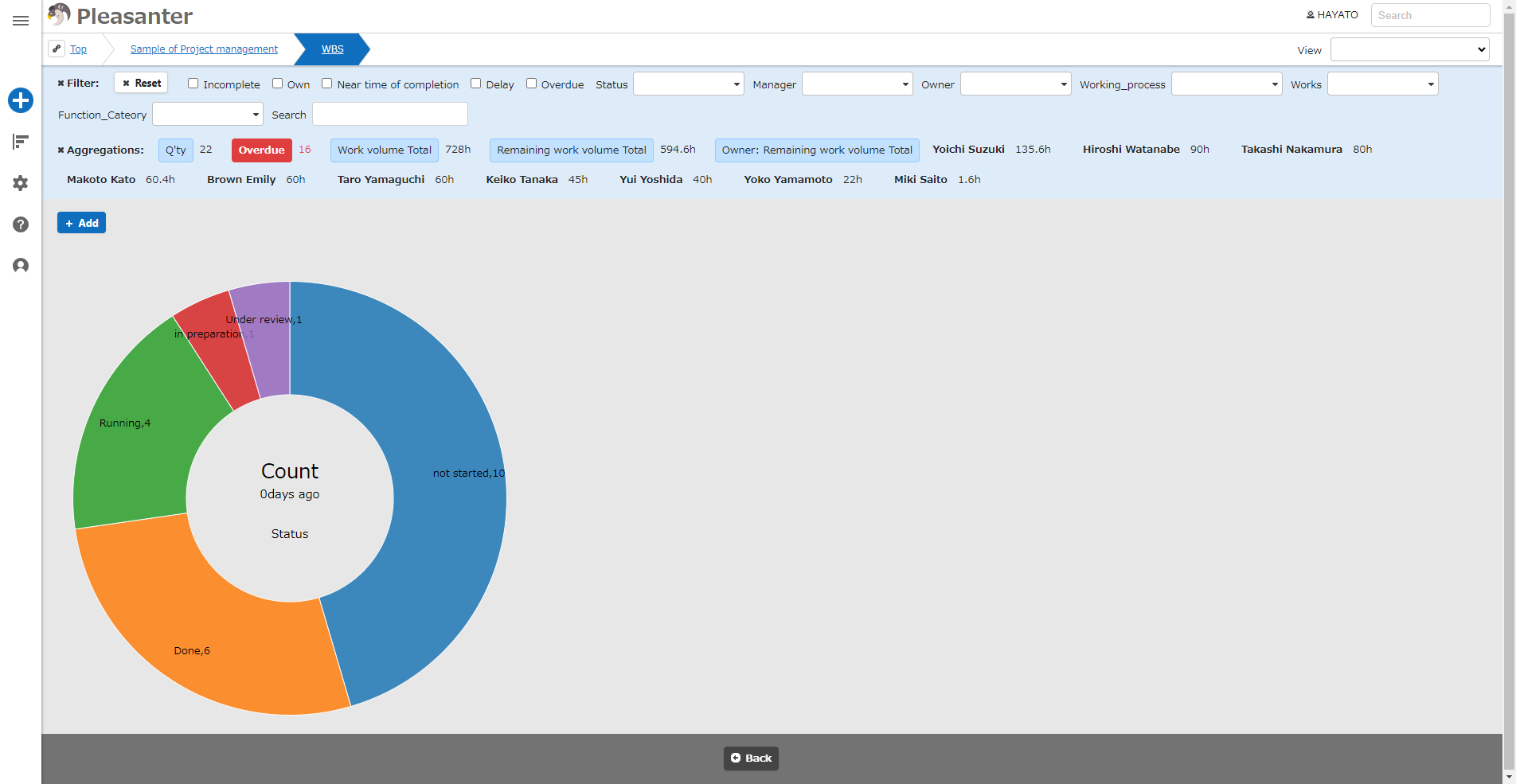
6. A pie chart will be added.
7. If you want to delete a pie chart, hover the mouse over it and click the × button that appears.
8. It is possible to display multiple pie charts, with labels with the same name displayed in the same color for easy comparison.

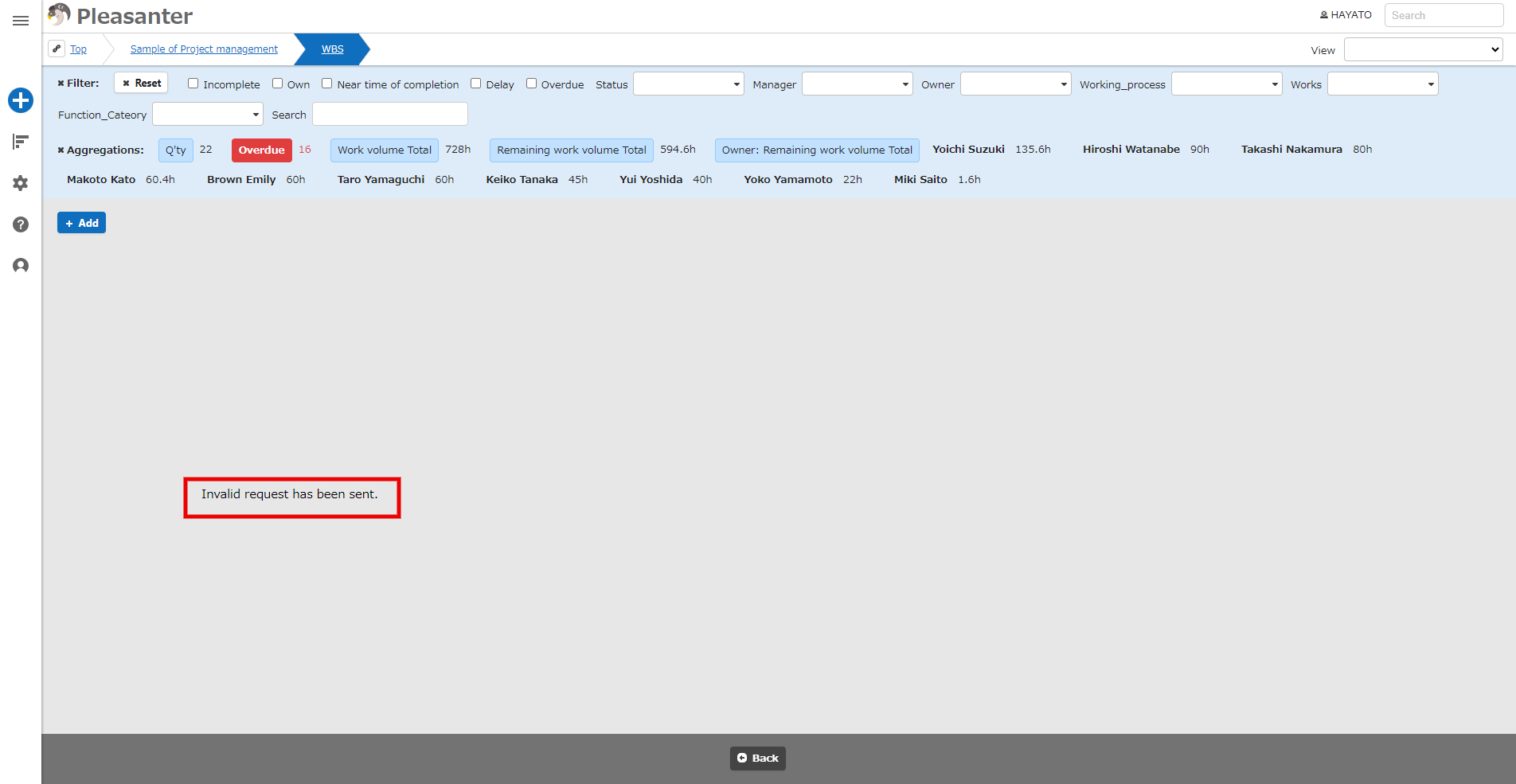
9. If the corresponding data does not exist, an error message will be displayed.
## Example Of Use
If you have the following records (NumA is enabled):

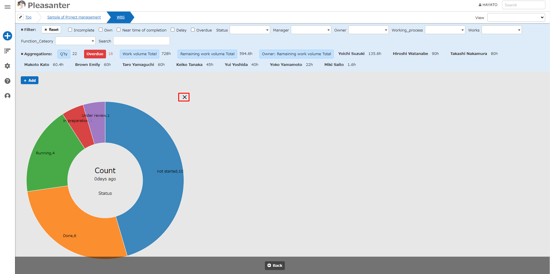
#### To Count The Number Of Cases By Status
1. In the analysis part dialog screen, specify "[Status](/en/manual/table-management-status)" as the column and "Count" as the aggregation type.
2. The graph will be displayed as shown below.

#### To aggregate the total of NumA by status
1. In the analysis part dialog screen, specify "[Status](/en/manual/table-management-status)" as the column, "Sum" as the aggregation type, and "NumA" as the aggregation target.
2. The graph will be displayed as shown below.

## About The Display Color Of The Pie Chart In The Analysis Chart
The display colors of the pie charts in the analysis charts use the color sets available in the JavaScript library "D3.js." Different color sets are used depending on the number of columns displayed, making the charts easily distinguishable.
|Number of columns|Color set|d3-scale name|
|:---|:---|:---|
|Less than 10 columns|10-color color set|d3.schemeCategory10|
|More than 11 columns|20-color color set|d3.interpolateRainbow|
The 20-color set will look like the image below.

### Reference URL
https://github.com/d3/d3-scale-chromatic/blob/main/README.md
## Analysis Chart Settings
You can change the settings of the analysis chart. This operation requires site administration privileges.
1. Open the target table.
2. From the "Manage" menu, click "[Manage Table](/en/manual/table-management)".
3. Open the "「Analysis Chart」" tab.
4. Configure the settings according to the table below.
|Column name|Description|Setting method|
|:---|:---|:---|
|Enabled|Set to Enable/Disable the analysis chart|Check to enable the analysis chart|
5. Click the "Update" button at the bottom of the screen.
## Related Information
<div id="ManualList"><ul><li><a href="/en/manual/table-management">Manage Table</a><span>12.09.2025 up</span></li></ul></article>
<ul><li><a href="/en/manual/table-management-status">Manage Table: Items: Status</a><span>12.09.2025 up</span></li></ul></article></div><input id="SearchTextHidden" type="hidden" value="" />